Building a Visual Identity That Sticks
People often recognize a brand before they read its name. A familiar color, a distinctive typeface, or a recognizable visual style can make a brand instantly memorable. That's the power of a visual identity that sticks.
The strongest brand identities aren't built around a beautiful logo alone. They're built on a consistent visual language that communicates who you are, what you stand for, and why people should remember you.
Recognition starts with consistency
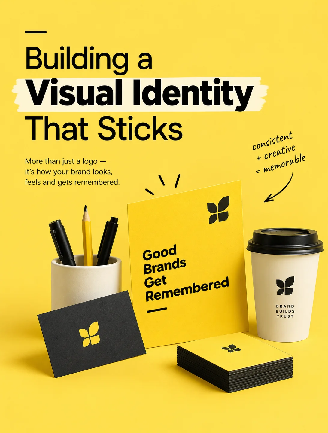
Your logo, colors, typography, imagery, and layout should feel like parts of the same story. When these elements work together across your website, social media, packaging, and marketing materials, they create a recognizable identity that builds familiarity and trust over time.
Three elements that make a brand memorable
- Choose a distinctive color palette — use colors that reflect your brand's personality and help you stand apart from competitors.
- Build a recognizable visual language — pair typography, imagery, shapes, and graphic elements that feel uniquely yours.
- Stay consistent across every touchpoint — repeat your visual cues so people can recognize your brand wherever they encounter it.
A memorable visual identity doesn't need to be complicated. It needs to be intentional, recognizable, and consistent. Because when every visual element tells the same story, your brand doesn't just get noticed — it gets remembered.